Antique World Map 1794 — Dunn, A New Map of the World
Description
The southern continent is missing, and that is the news
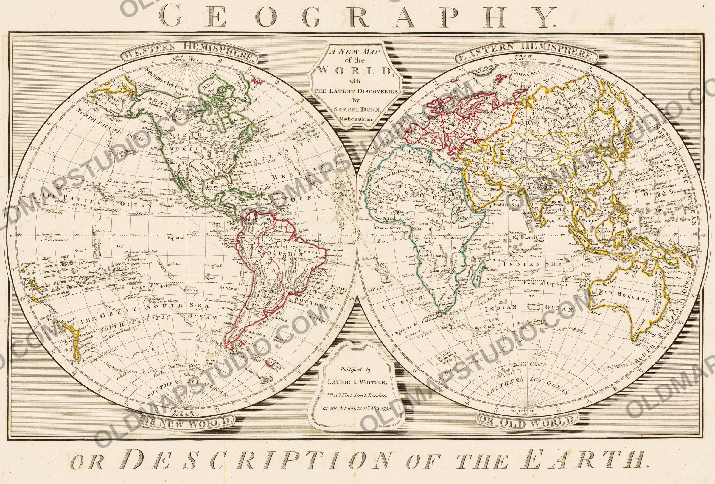
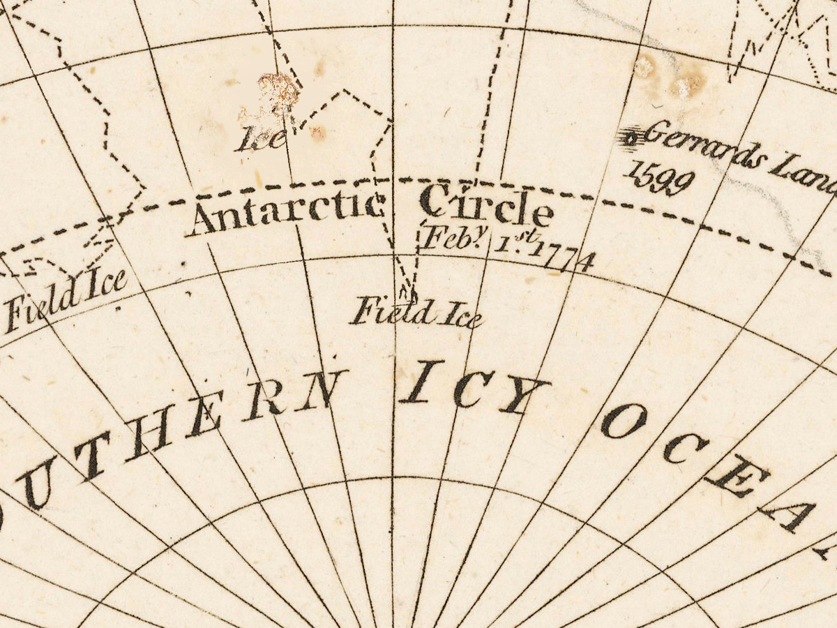
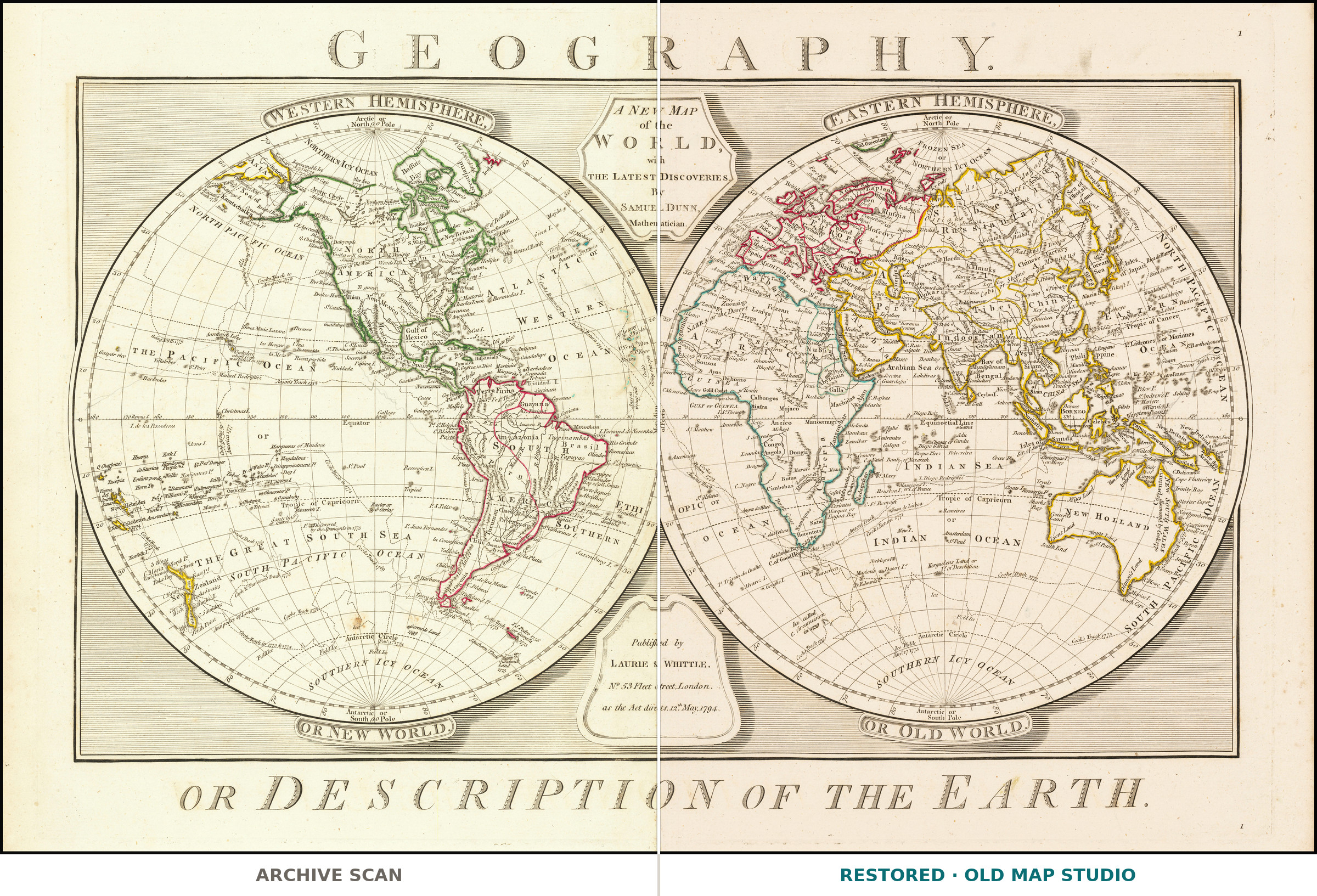
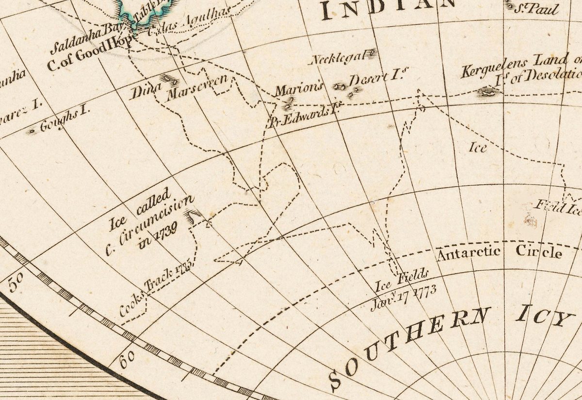
For two centuries every world map carried a continent along its bottom edge. Mapmakers drew Terra Australis with a firm coastline because symmetry demanded it: all that land in the north had to be balanced somewhere. Then in 1773 and 1774 James Cook took the Resolution across the Antarctic Circle, sailed east along the ice, and found nothing but ice. This is what a world map looks like once that news has landed: at the foot of both hemispheres there is now only Antarctic Circle, Southern Icy Ocean and a line reading Ice, called C. Circumcision or Ice Islands. Emptiness, drawn honestly, where a century of confident coastline used to be.
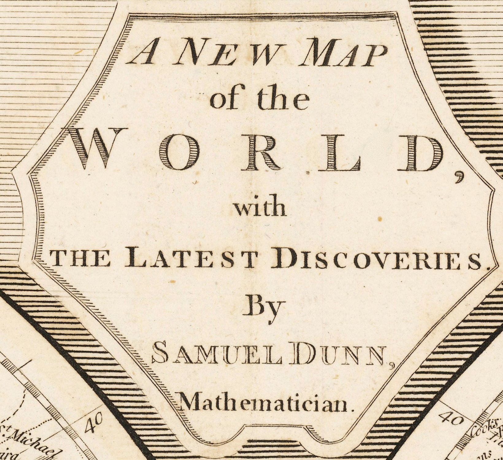
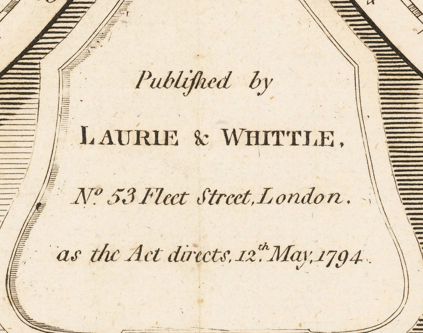
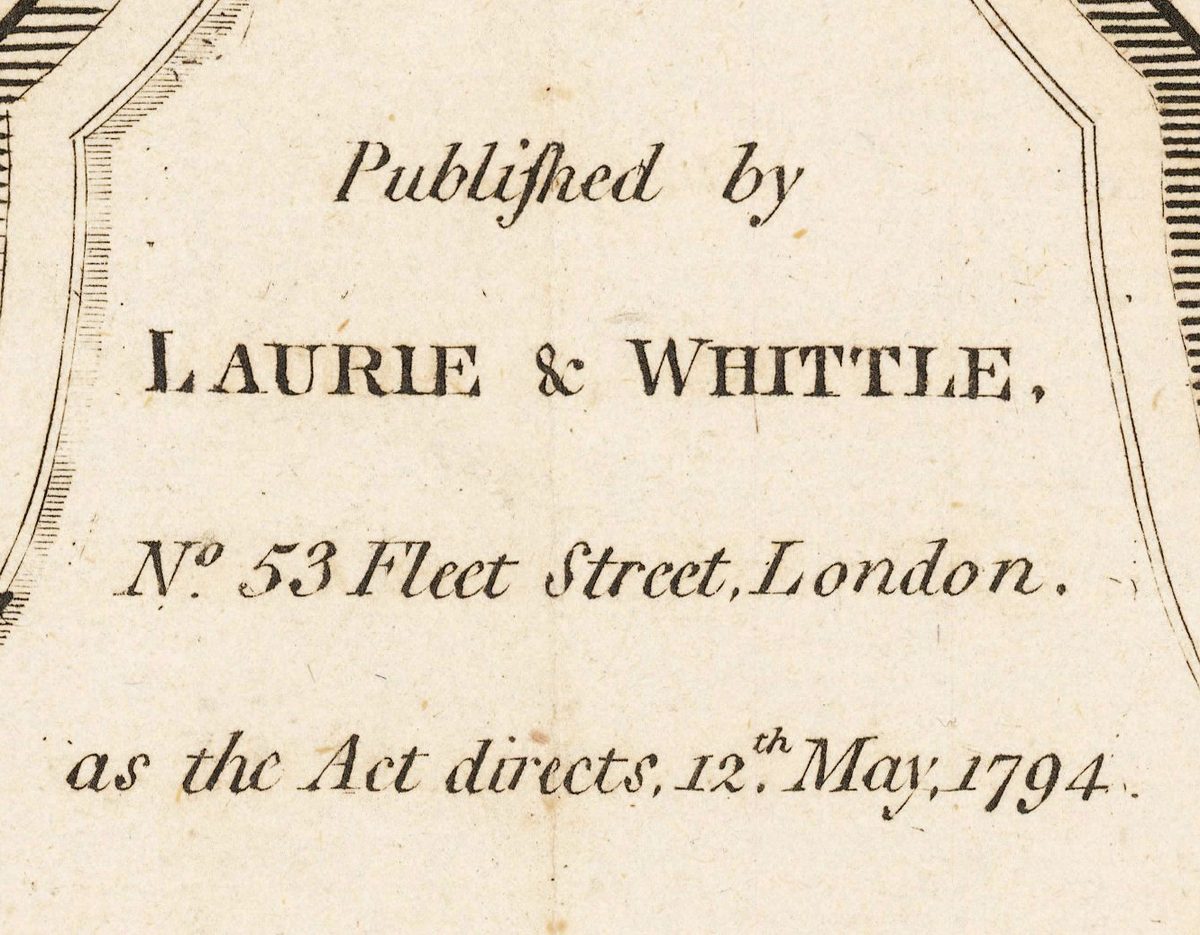
The imprint under the frame reads Published by Laurie & Whittle, No. 53 Fleet Street, London, as the Act directs, 12th May 1794. Samuel Dunn had died in London that January. The sheet went on sale four months after its author.
What you can find on the sheet
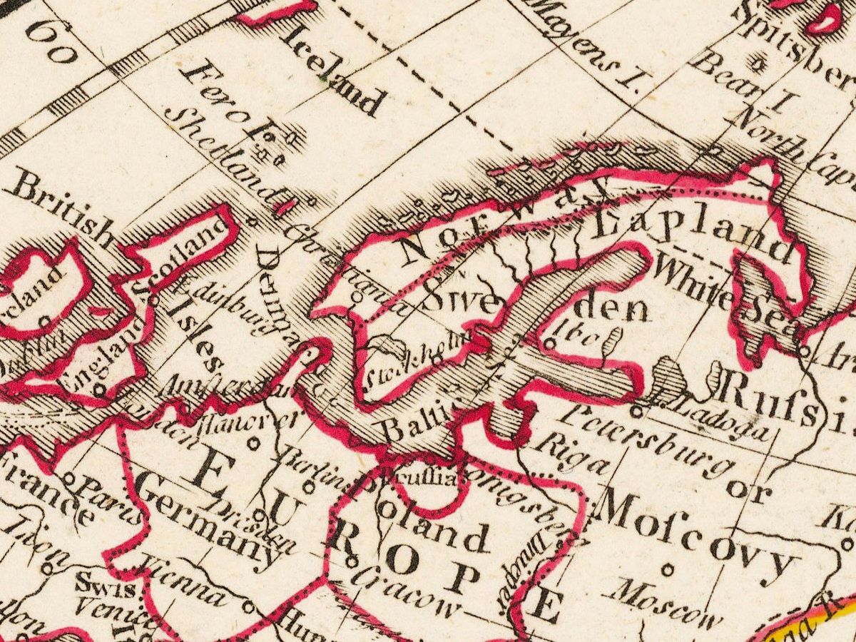
All of it is on the sheet and readable at full size. Several of them are shown as 1:1 crops on this page, so you can judge the line before you buy.
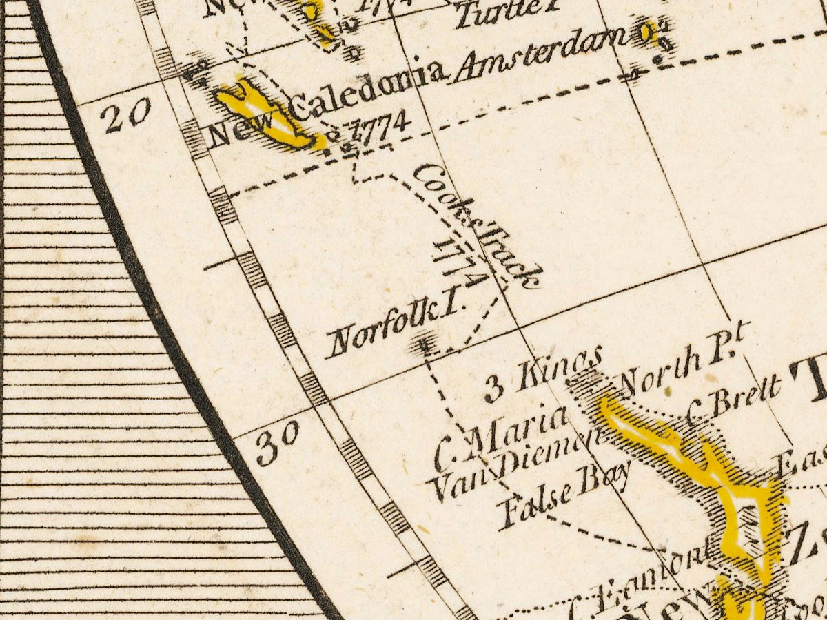
- All three of Cook's voyages, on one sheet. The tracks run across both hemispheres: Cook's Track 1769, then 1773, 1774, 1775, then 1778. The last belongs to the voyage he did not come back from — Cook was killed in Hawaii in February 1779, fifteen years before this impression was pulled.
- The generation before him is here too — Byron 1765, Wallis 1767, Carteret 1767, Anson's track. Together they are the Pacific being closed, decade by decade.
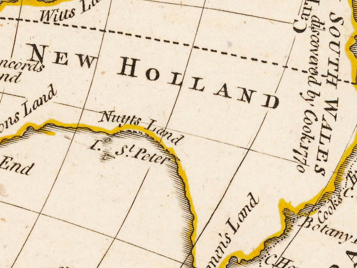
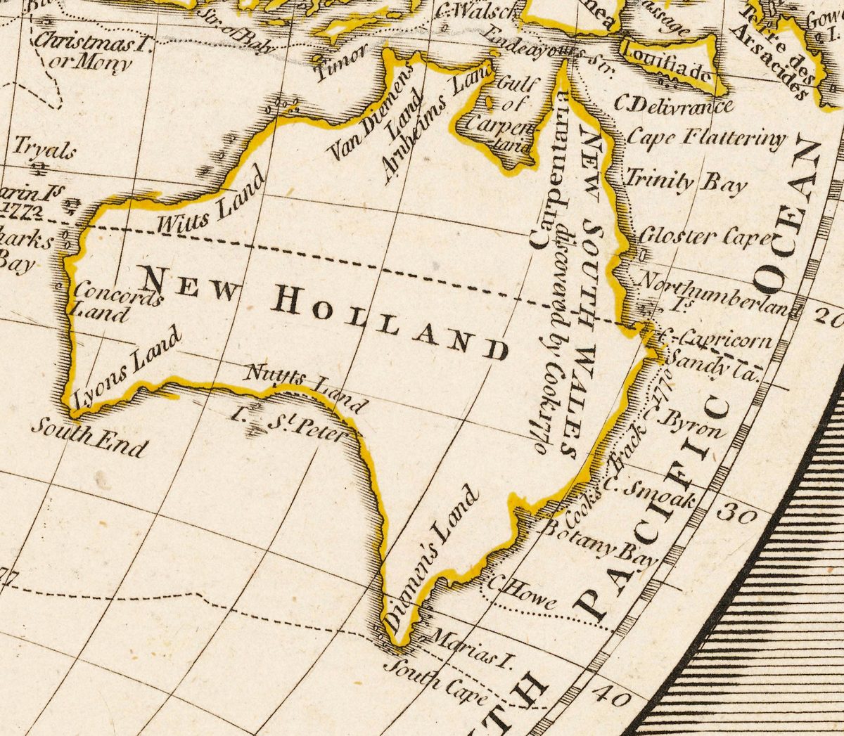
- Australia is still NEW HOLLAND, and its east coast is already NEW SOUTH WALES discovered by Cook 1770. The contrast is the point: the east is drawn bay by bay, while the west and south survive as fragments — Nuyts Land, Arnheims Land, Carpentaria. Nobody had yet sailed round it.
- Longitude is counted from Ferro, the westernmost Canary island — a London map, printed in Fleet Street, still using a Spanish island as zero. Greenwich did not become the world's prime meridian until 1884.
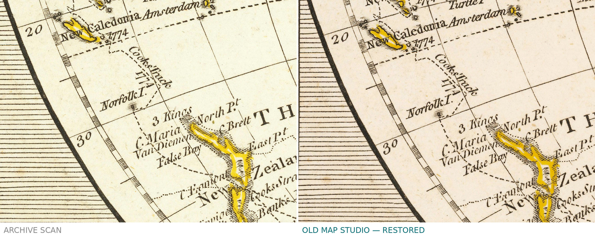
- New Zealand as Cook left it: two islands and the strait between them, Cook's Straits, C. Maria Van Diemen, 3 Kings — the survey of the first voyage.
- The north of America is left open. Past Mt St Elias and C. Edgecumbe the coastline dissolves into hatching and stops, under Frozen Sea or Northern Icy Ocean. The Northwest Passage was still an open question, and the engraver did not pretend otherwise.
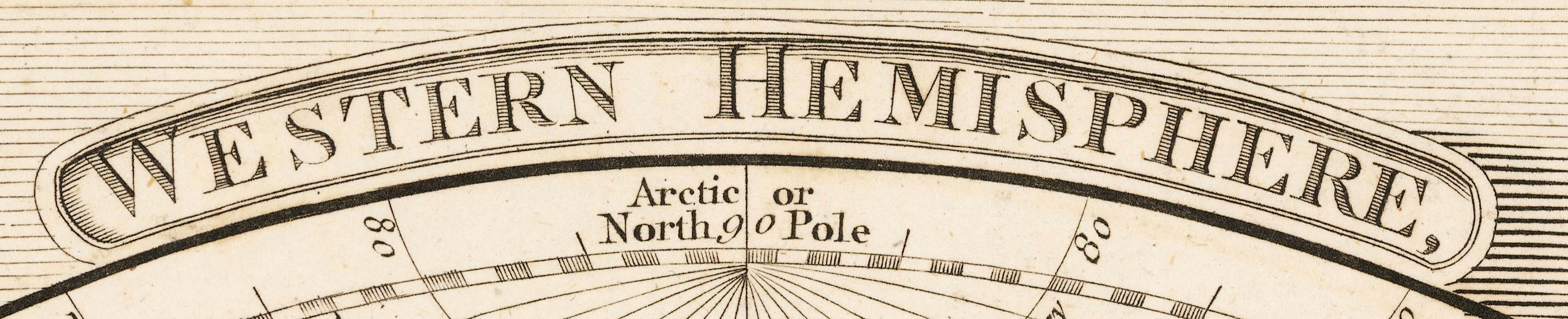
- It is a book page, and says so. The hemispheres are labeled NEW WORLD and OLD WORLD; above the frame stands GEOGRAPHY. and below it OR DESCRIPTION OF THE EARTH., with the plate number 1 in the corners.
- Outline color of the period, applied by hand along political borders — Russia and Hindustan yellow, Europe crimson, South America pink, North America green, Africa turquoise along its western and southern shores. A thin band, not a flat fill: the engraving stays visible underneath.
Samuel Dunn, mathematician
Dunn (1723–1794) was born at Crediton in Devon and taught himself enough mathematics to start teaching it to others: writing, accounts, navigation, "the mathematical sciences". He ended his career as master for the longitude at sea and as the mathematical examiner who tested East India Company candidates — the man who decided whether an officer could be trusted to find his own position. He sent nine papers to the Royal Society's Philosophical Transactions between 1761 and 1771 without ever being elected a Fellow of it.
His New Atlas of the Mundane System, or of Geography and Cosmography appeared in 1774 with sixty-two copper plates and was reissued in 1788 and 1789. This is plate 1 of its geography section in the 1794 issue, printed by Laurie & Whittle of Fleet Street. A world map made by a navigation examiner shows it: the tracks, the ice limit and the open coastlines matter more here than decoration.
What restoration was done — and what was not
- Rebuilt in the collection's paper tone. This sheet was first restored in August to an earlier tone standard; the file you download was rebuilt from the scan to the current one, with the scanner edge and the trimmed border set again.
- One stain removed from the title. A blue spot inside the title, between the L and the D of WORLD, was brought back to the tone of the paper around it — 6,149 pixels in all. The engraved line was not touched.
- The margins were inspected for stamps. Everything outside the engraved frame turned out to be printing — the typeset lines, the double frame rules, the plate number. No stamps, no ownership marks.
- Geometry untouched. No rotation, original proportions kept.
Your file
| Resolution | 13 315 × 8640 px for the full sheet with its typeset lines; 12 101 × 8193 px trimmed to the engraved frame |
|---|---|
| Print size at 300 dpi | the map prints to 102 cm (40 in) trimmed to the frame, the full atlas page with margins to 112 cm (44 in), on the long side |
| At the original's own size | the source does not record the sheet's measurements, so we make no claim about natural size — only about pixels |
| Color | JPEG, quality 96, 4:4:4 — no chroma subsampling. sRGB with the profile embedded, progressive, 300 dpi |
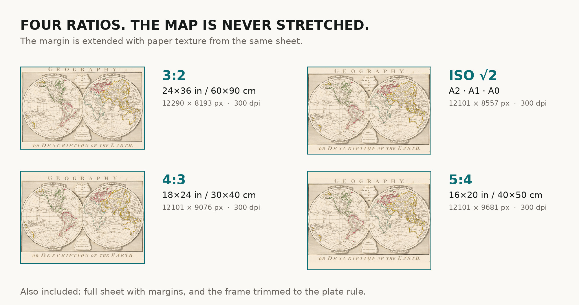
What you download: six separate ZIP archives, one per frame shape — the full sheet, a version trimmed to the engraved frame, and four ratio versions built by extending the margin, never by stretching the image: 3:2, 4:3, 5:4 and ISO A (A2–A0). Take the one that fits your frame and leave the rest. Inside every archive are exactly three files: the image, the one-page restoration passport as a PDF, and a README giving the pixel size and a note on how the margin was extended. No TIFF master is included — no print shop asks for one, and a second archival file would double the weight for nothing that shows on paper.
Both are in the package on purpose: the version trimmed to the engraved frame for a strict rectangle of map, the full sheet for the whole atlas page with its typography.
Printing it
Send the file as it is — sRGB, no conversion. Matte or lightly textured art paper of 200 g/m² or heavier suits a copper engraving better than gloss, and keeps the period outline color from reading as modern ink. At a meter wide this is firmly a print-service job, and the archive includes a size chart to hand over with it.
Screen and paper never match exactly: a monitor emits light, paper reflects it. The warm tone here is the paper of the 1790s, and it will read slightly deeper in print than on screen.
Where to print it: print shops near you and checked prices at online labs.
Source and rights
The scan comes from Wikimedia Commons, File:1794 map of the world by Samuel Dunn.jpg, in the public domain. We name that rather than a library and a shelf mark because for this sheet there is none to name: the source is a photograph of a real copy, and the institution holding that copy is not recorded. The passport PDF says exactly the same thing. Catalogue record: Wikimedia Commons →
What we vouch for is the file: every measurement above was taken on it, and the before-and-after comparison on this page shows each change we made.
Questions
What exactly do I get after payment?
Six ZIP archives, one per frame shape — the full sheet, the version trimmed to the engraved frame, and four ratio versions (3:2, 4:3, 5:4, ISO A). You download the one that fits your frame. Inside are three files: the image as a JPEG at quality 96, 4:4:4, the restoration passport as a PDF, and a README. No watermark, no expiry, no account needed after download.
How large can I print it?
At 300 dpi the map comes to 102 cm on the long side and the full sheet with margins to 112 cm, measured on the file you receive, from the scan's own pixels — no upscaling counted.
Is this a real antique map or a generated image?
It is a photograph of a real printed sheet from 1794, released into the public domain. Nothing is generated and nothing is redrawn; every change we made to that photograph is listed above and in the passport PDF.
Is the color yours or the original's?
The original's. Outline coloring, applied by hand in the 1790s along political borders — a thin band following each frontier, not a wash over the land. Our work was to bring the paper back to its own tone so the color reads as it did, not to add any.
Why is the paper texture slightly noisy up close?
The source photograph is a heavily compressed JPEG — 21.7 MB for 115 megapixels, about 0.19 bits per pixel — and the compression sits in the paper. We left noise reduction deliberately weak because turning it up removes the artifacts and the paper texture together. At normal viewing distance you see paper; above 1:1 you see the compression. We would rather say so than smooth the sheet into plastic.
Can I use it commercially?
The original is public domain, so the map itself carries no restriction. Which license applies to our restored file — personal or commercial — is set on this page at purchase.
Features
- English
Attachments
Reviews
No reviews found
See also
-
 Antique World Map 1579 — Ortelius, Typus Orbis Terrarum
-
Antique World Map 1680 — Sanson, A Mapp of All the World
-
Antique World Map 1740 — Seutter, Diversi Globi Terr-Aquei
-
Antique World Map 1706 — Moll, A New Map of the World
-
Old World Map — Mappemonde de Leipzig, Jomard's Monuments
-
Antique World Map 1752 — Robert de Vaugondy, Mappemonde